One part of my project I haven't looking to much into yet is how I'm going to be branding/presenting it. I want something quite simple so that it does not detract from my work but also still interesting. Below are just a couple of images that I either like the layout or the colour scheme of and I'm using them as inspiration for my own template.
The next step is thinking about the font and the colour scheme I am going to be using. I would like to use two different types of fonts one of the titles and then another for the rest of the text.
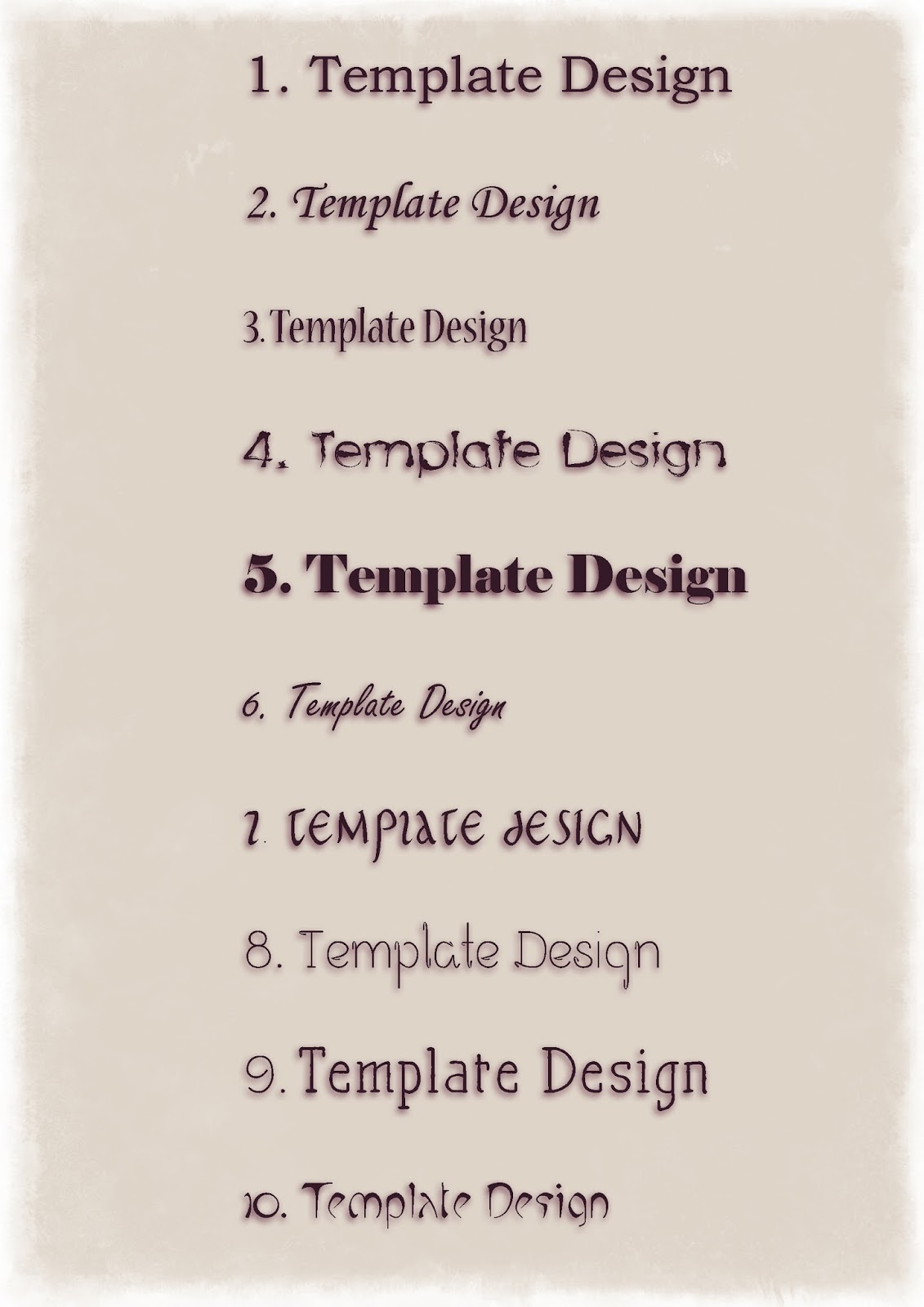
To help decide between the fonts I put a few of them together to see which ones would work best together. I quite like 1 and 2, and for now I think I might stick with them.
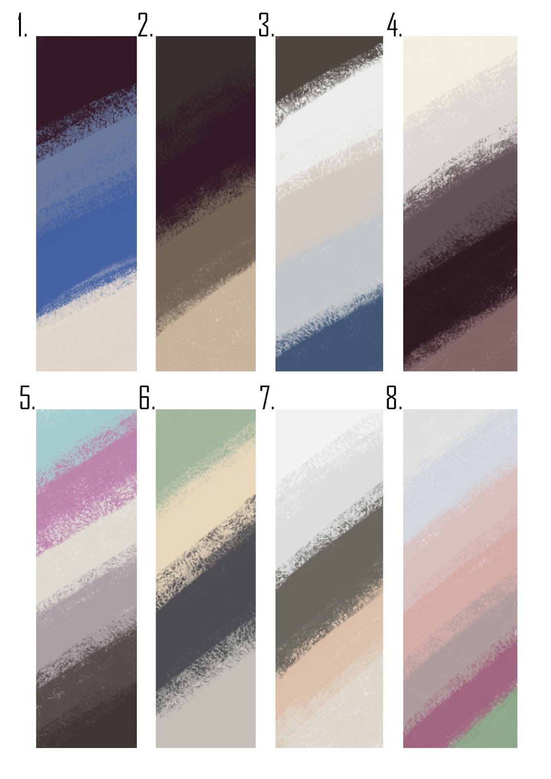
For the colour scheme I really like 4. but I feel like it needs a contrasting colour with it so I did a three more colour pallets with 4. but just replacing one of the colours with a contrasting one.
I really like number 11 and I think that is the colour scheme that I'm going to be going with.


Hi Kym...
ReplyDeleteA few thoughts...
Fonts:
1) Less is more...Its hard to judge your fonts because of the colour, background, and drop shadow. Make them black and put them on a plain white background.
2) Less is more 2...All of your fonts are too 'busy', avoid scrolling or 'frilly' fonts. Look for clean and simple (Number 1 is closer to the type of font you could use).
Colours
1) Amount, Balance and Proportion...When choosing colour consider the amount of each you will be using. Rather than creating 'strips' of equal amounts create a series of boxes which represent the amount of colour that will appear in your page. So in the case of number 11 the three darker colours may only represent 1/10th of your final page. Amount is very important. Take a look a the auto colour scheme generator below....
http://paletton.com/#uid=54k0u0kjfdpbPiWdzeenjbwsi8E
Above the main colour wheel are 4 circles (icons) which represent 4 colour models...monochrome (one base colour), Adjacent (three adjacent base colours), Triad (three opposite base colours), and Tetrad (4 base colours). In the center are different hues. On the right is a diagram of amount and if you click on examples it shows you an example graphic (website) layout.